SunStar Media delivers custom responsive web design solutions engineered to support modern B2B organizations across all devices and screen sizes. Our responsive design framework ensures your website delivers a consistent, high-performance experience on desktops, laptops, tablets, and smartphones—without compromising speed, usability, or search visibility.
Built using HTML5, modern CSS, and performance-focused architecture, our responsive websites adapt intelligently to each device, providing a single, unified platform rather than separate desktop and mobile sites.
What Responsive Design Means for B2B Organizations
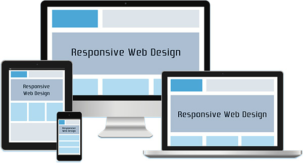
Responsive web design allows a single website to automatically adjust layout, navigation, and content presentation based on screen size and device capabilities. For B2B companies, this ensures stakeholders—executives, buyers, partners, and prospects—can access critical information seamlessly, regardless of how or where they engage with your site.
Unlike legacy mobile-only solutions, responsive design eliminates redirection issues, duplicate content, and fragmented analytics—resulting in a cleaner, more scalable digital infrastructure.
Business Benefits of Responsive Web Design
Expanded Reach Across Devices
A responsive website enables your organization to reach desktop, tablet, and mobile users with one consistent platform—improving accessibility for decision-makers who increasingly research and evaluate vendors across multiple devices.
Improved Conversion Rates and Search Performance
Consistent user experience across devices reduces friction, improves engagement, and supports stronger conversion performance. Responsive design is also aligned with modern search engine indexing requirements, contributing to improved organic visibility and rankings.
Simplified Analytics and Reporting
A single responsive website consolidates analytics, making it easier to measure user behavior, performance metrics, and conversion paths without managing separate sites or data streams.
Lower Long-Term Maintenance Costs
Maintaining one responsive site—rather than multiple device-specific versions—reduces technical debt, streamlines updates, and simplifies ongoing optimization efforts.